Stage 1: Analysis and Kick-off
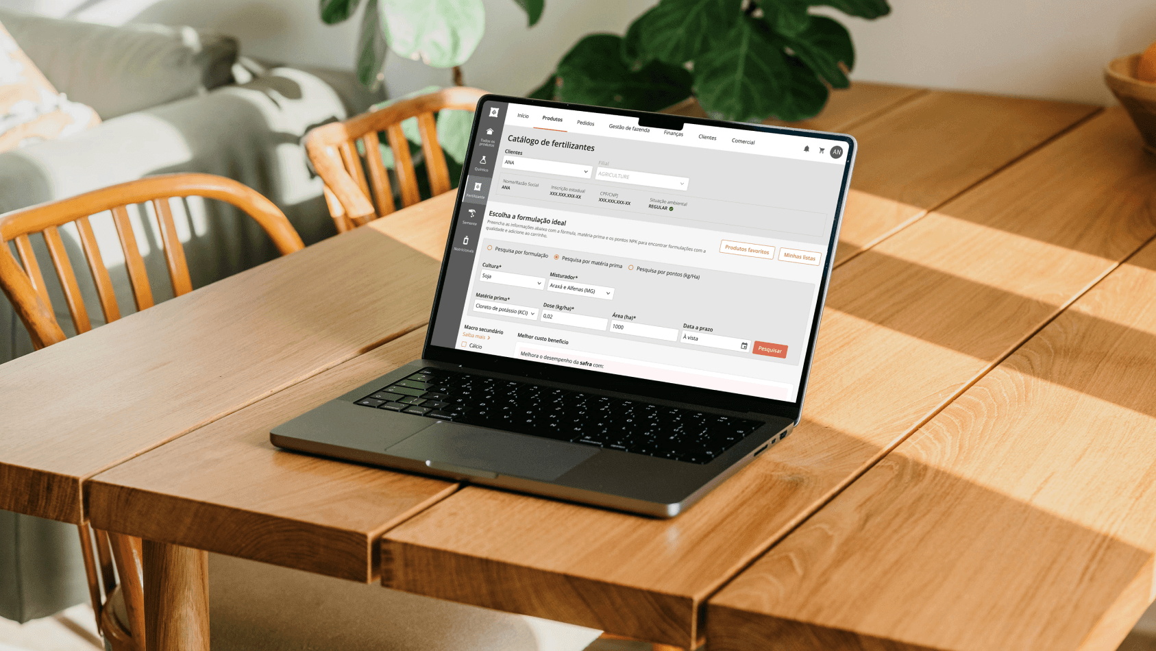
I carried out a detailed analysis of the catalog's existing screens, which previously did not display price information. Reviewing the old design allowed me to understand the mapped user experience and align business needs and customer experience objectives.
The focus was on ensuring that the redesign of the catalog met the requirements of adding product prices without compromising the information architecture.
Stage 2: Ideation Workshop
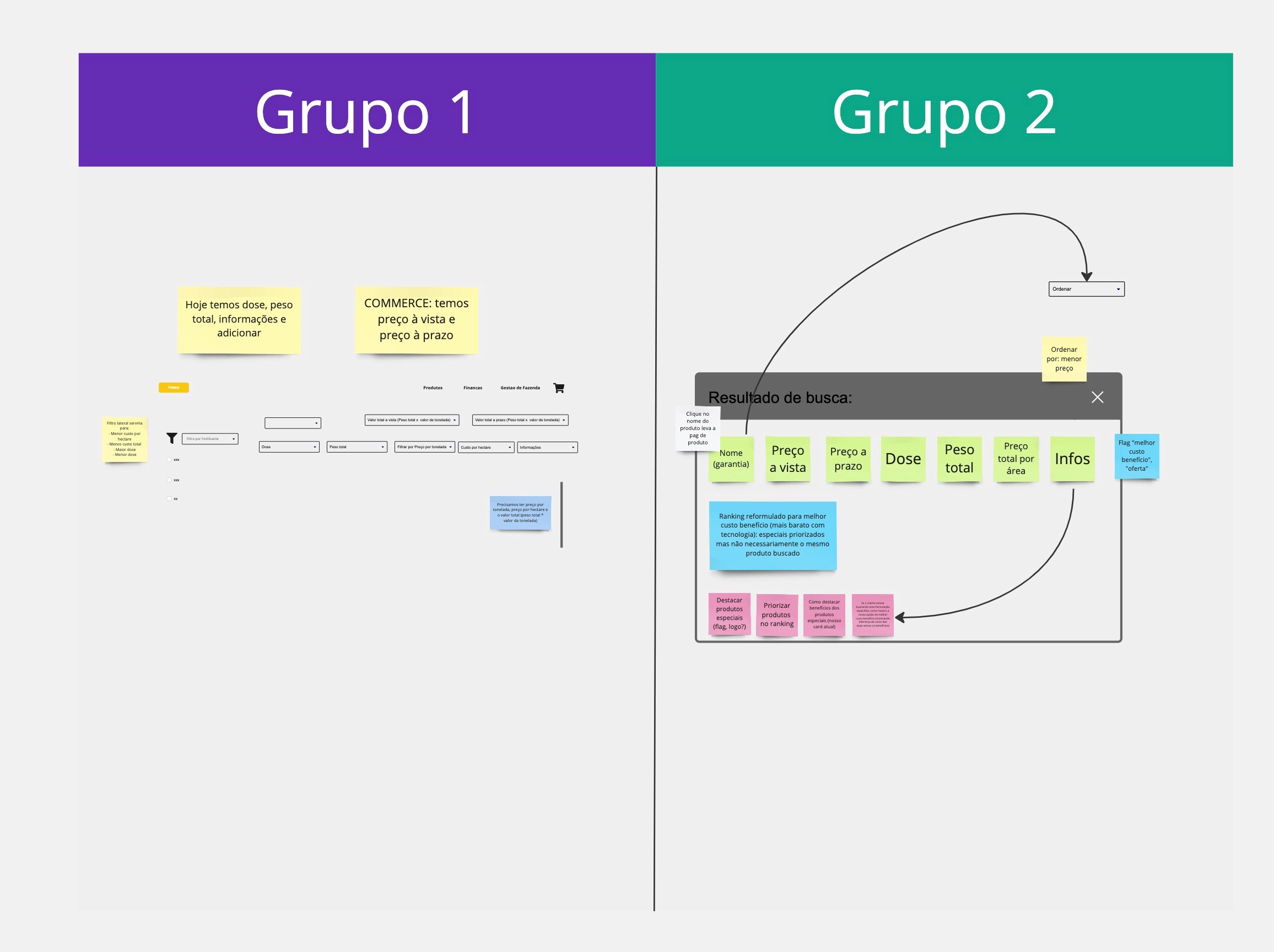
To deepen the understanding of the business rules, I organized a collaborative workshop at Miro. The stakeholders were divided into two groups to explore creative solutions and define how to integrate price information into the catalog screens. This session generated valuable feedback that refined the concepts and helped plan the next steps.
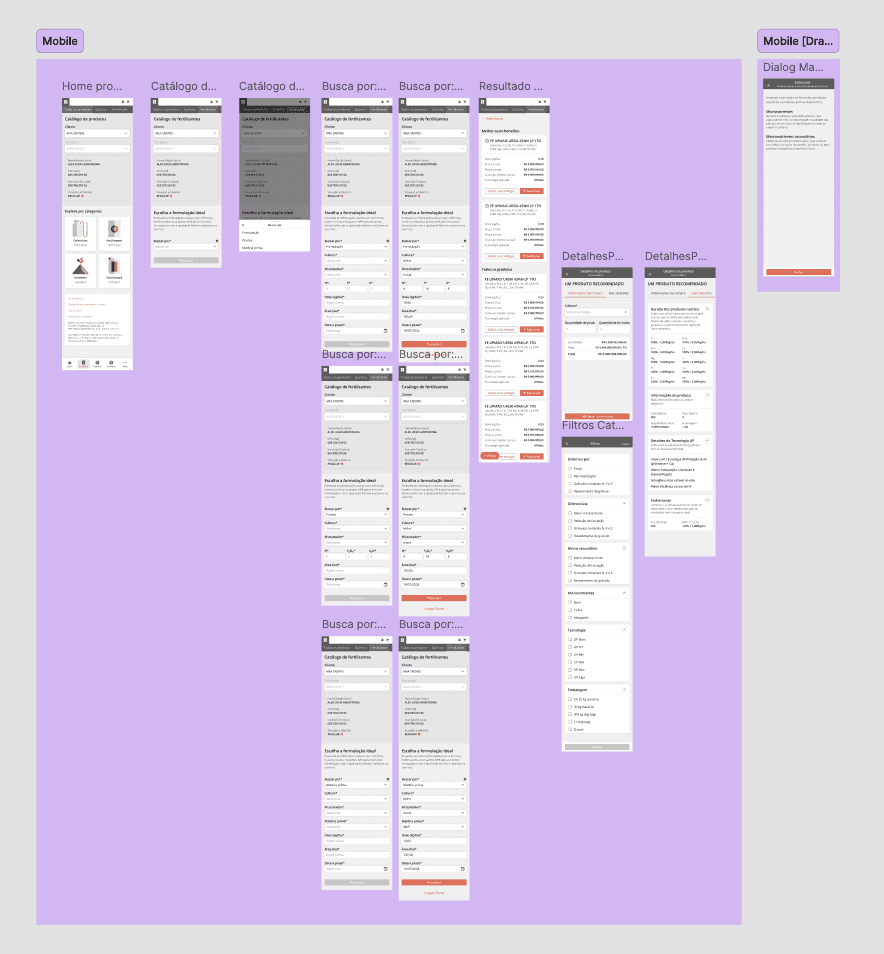
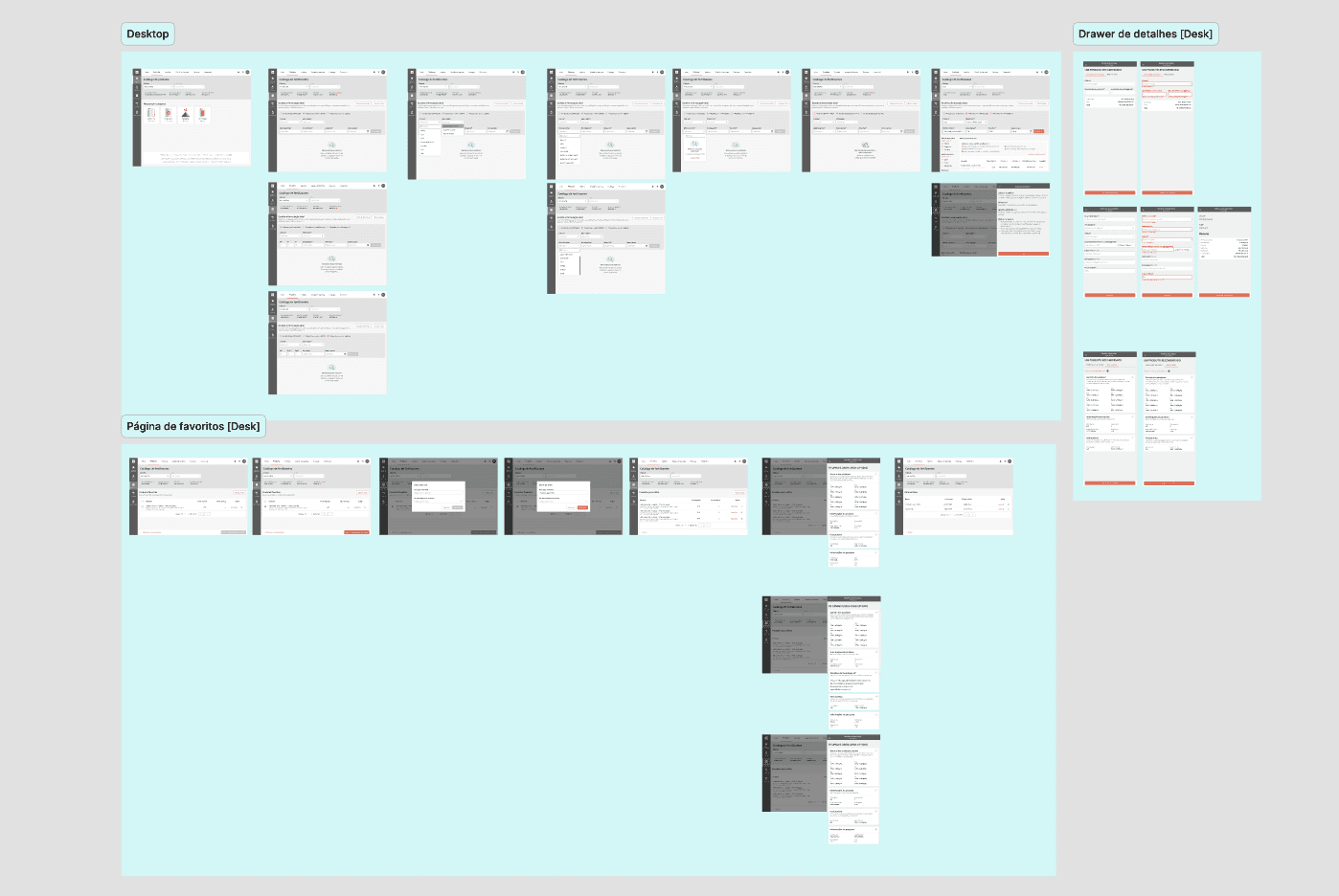
Stage 3: Wireframes and Prototyping
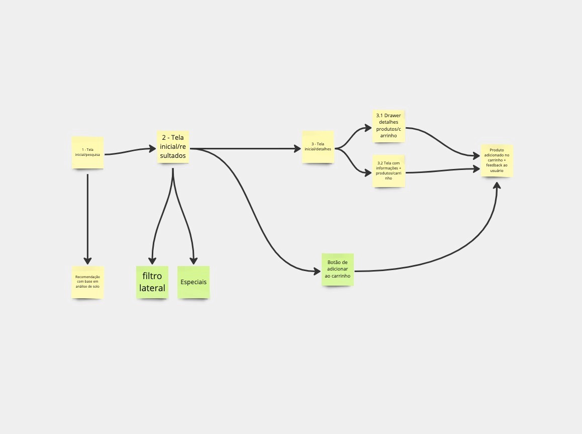
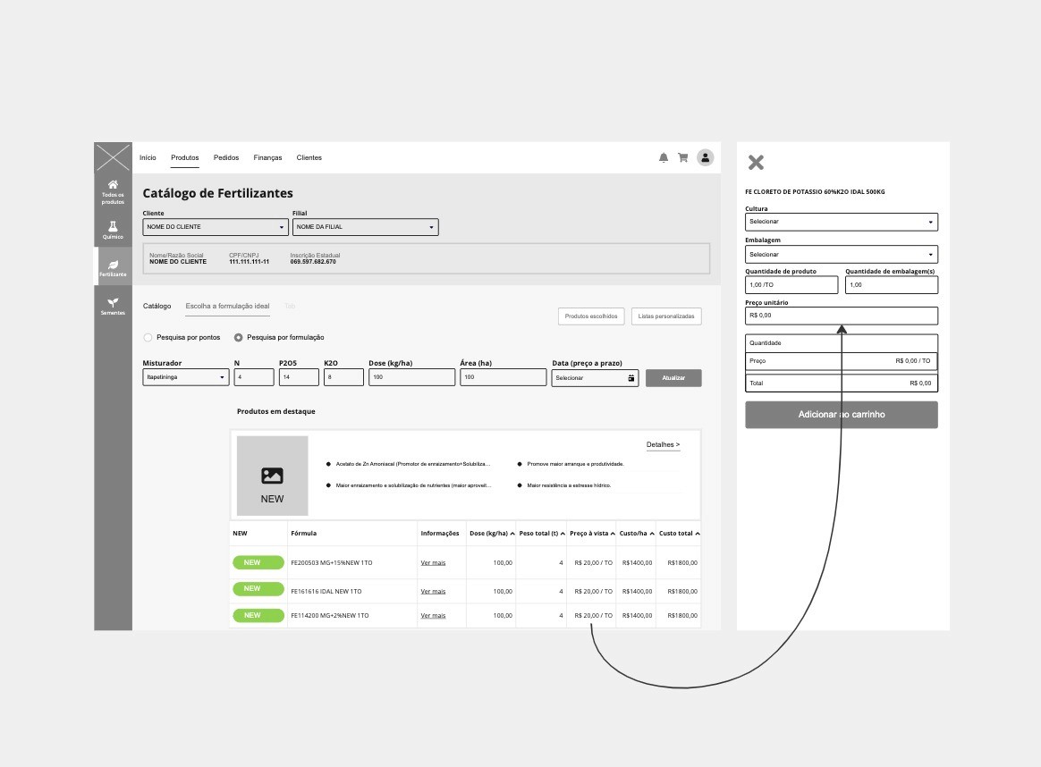
Based on the ideas from the workshop, I created low-fidelity wireframes in Miro, which were transformed into interactive prototypes in Figma. The aim was to maintain the existing architectural patterns while including the new pricing information in a clear and accessible way.
Stage 1: Analysis and Kick-off
I carried out a detailed analysis of the catalog's existing screens, which previously did not display price information. Reviewing the old design allowed me to understand the mapped user experience and align business needs and customer experience objectives.
The focus was on ensuring that the redesign of the catalog met the requirements of adding product prices without compromising the information architecture.
Stage 2: Ideation Workshop
To deepen the understanding of the business rules, I organized a collaborative workshop at Miro. The stakeholders were divided into two groups to explore creative solutions and define how to integrate price information into the catalog screens. This session generated valuable feedback that refined the concepts and helped plan the next steps.
Stage 3: Wireframes and Prototyping
Based on the ideas from the workshop, I created low-fidelity wireframes in Miro, which were transformed into interactive prototypes in Figma. The aim was to maintain the existing architectural patterns while including the new pricing information in a clear and accessible way.
Step 4. Usability testing
To validate these projects, I scheduled interviews with sales consultants and business experts to gather their perceptions on the impact of adding pricing information.
The user test involved six participants and aimed to assess how adding prices, including terms such as "cash price" and "installment price", would affect their daily tasks. A satisfaction survey was carried out to quantitatively measure their experiences and collect feedback on usability.
Step-by-step process:
I prepared and documented the remote usability test report.
Participants were recruited for tests.
I ran the tests and analyzed the results.
Discoveries and insights were documented.
Results obtained:
The usability tests showed positive results, with four participants evaluating the flow of the interface with a score of 5 on the Customer Effort Score (CES).
One participant suggested adding graphics to better differentiate the products, which led to final adjustments being made to the prototype before it was handed over to the development team.
Step 5. Presentation and Handoff
Compilation of a detailed project report and presentation to stakeholders, highlighting the impact of the new interface on the user experience.
The design specifications and files were handed over to the development team to ensure a smooth transition.